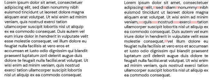
Every day it is less common to find web pages that use full justification, but even today it is very common when we see a text justified to the left.
On paper, you can justify texts, on digital you can’t.
We have inherited from analogical books the aesthetics of complete justification, we find it in most of the books on our bookshelf. The absolute order, elegance, and peace that it transmits take us to a much more harmonious and controlled place.
But the truth is that this characteristic was left behind when our environment was digitized and we began to create online content. New support gives way to new ways of designing and understanding space, as well as the adaptation of a typographic composition to this medium.
A new era of communication in pixels is no longer so controlled. We no longer measure millimeters nor can we control the position of each letter, the responsive world creates a new way of understanding space in the design of our website.
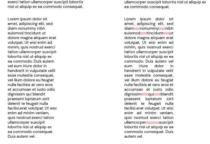
The main difference between designing a book or designing a web page is that we stop controlling each parameter and we come to understand that when we apply a full justification in web design, the space of each line will be automatically calculated and, depending on the width of the column, the words will be distributed in the best possible way to fill that line, thus creating large white rivers.
We can see this in the following example:


Unsightly and not very functional
The complete justification on the web is not only an obsolete resource that is not very aesthetic, but also not very functional. It prevents the user from being able to read it smoothly and pleasantly.
Let’s embrace the uneven, let the lines flow
This desire for control comes from the need of many people to see the right side of the columns perfectly aligned, something that, once overcome (see the column of this post), is nothing more than a characteristic of a paragraph prepared to be read and understood.
I am sure that while you were reading this text you had no problems, you were able to read quickly without getting lost and without looking at the composition. As has been stated many times in the world of design: “Good design is not hidden”.
You should never use full justification in your web page design
In short, let’s wholeheartedly embrace the left (or right) justification of texts but never use full justification in web design. Not only will it spoil the appearance of the web page, but it will also create confusion for the user and they will not be able to correctly read the content that we want to communicate.
Benefits of a good web design
The website is a digital presentation letter and the perfect showcase to show the values and products/services of a company on the Internet.
For this reason, the portal must be as effective and optimized as possible. Your website will be the one that will lead to the final conversion to the user. Bad design will not help us to create Online Marketing strategies to attract new customers if later our website does not have a friendly interface or does not project the desired image, among others.
Without a doubt, there are many benefits that a good web design can have for your company.
The 3 main advantages of a custom web design
1. Increased customer confidence
Getting the user to feel comfortable and safe browsing your website is one of the essential tasks to achieve. How do we do it? The answer is very simple: Create a web design tailored to the company where the user feels safe buying or requesting information about your products and/or services.
For this, many factors will come into play: The creation of an easy-to-use interface, the inclusion of legible typography, modern designs, brand colors, quality images of your company, and, in conclusion, a friendly visual composition that conveys professionalism, trust and the values for which your company stands out.
2. Improve the user experience

The user experience (UX) is one of the most relevant factors to take into account when creating a web design. It will not do any good to create quality content for your pages if later your website is not easy to use or does not order the information properly.
All the effort and money you have invested in your online marketing strategy will be in vain if we cannot create a page that attracts the user and invites them to stay.
A factor that greatly influences the user experience is the loading speed. According to the most recent studies, if a web page takes more than 3 seconds to load, more than half of users will leave before even giving it a chance, and the vast majority will never try again. Users are always looking for immediacy, and that is a point that we must take into account.
Another factor that will influence the user experience is navigation. The key is to always offer the most simplified navigation possible. Where the user can navigate and explore your website in the easiest way possible.
If we offer a user-friendly website with aspects similar to those that the user is already accustomed to seeing on other websites, we will make them stay longer and increase our chances of conversion (sales, calls, contact forms, etc).
3. Good for SEO (Search Engine Optimization)
The creation of an updated and modern web design will help us not only to create a beautiful visual section for your company, but it will also give us a hand to improve its position in Google (SEO).
In other words, the creation of a good web design will give us the possibility of increasing the traffic we receive through Google and other search engines.
A fundamental point that will have a very positive influence on the positioning of your website is responsive web designs or Mobile First designs. That is web designs are designed mainly to be visited from mobile devices.
Increasingly, most users who browse the Internet do so from their mobile phones, and Google is aware of them, so it is very important that your website is 100% adapted to mobile users.


